Expokit
About
Docs
Components
Charts
Blocks
Pricing
Sign in
Get started
Docs
/
Blocks
Blocks
Docs
Blocks
Blocks
Complete, production-ready screens — sign in, onboarding, settings, checkout and more — built from ExpoKit components. Add one and wire it to your data.
9:41
Chat
Pro
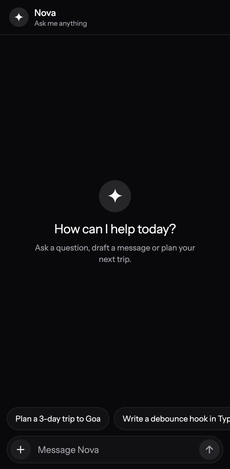
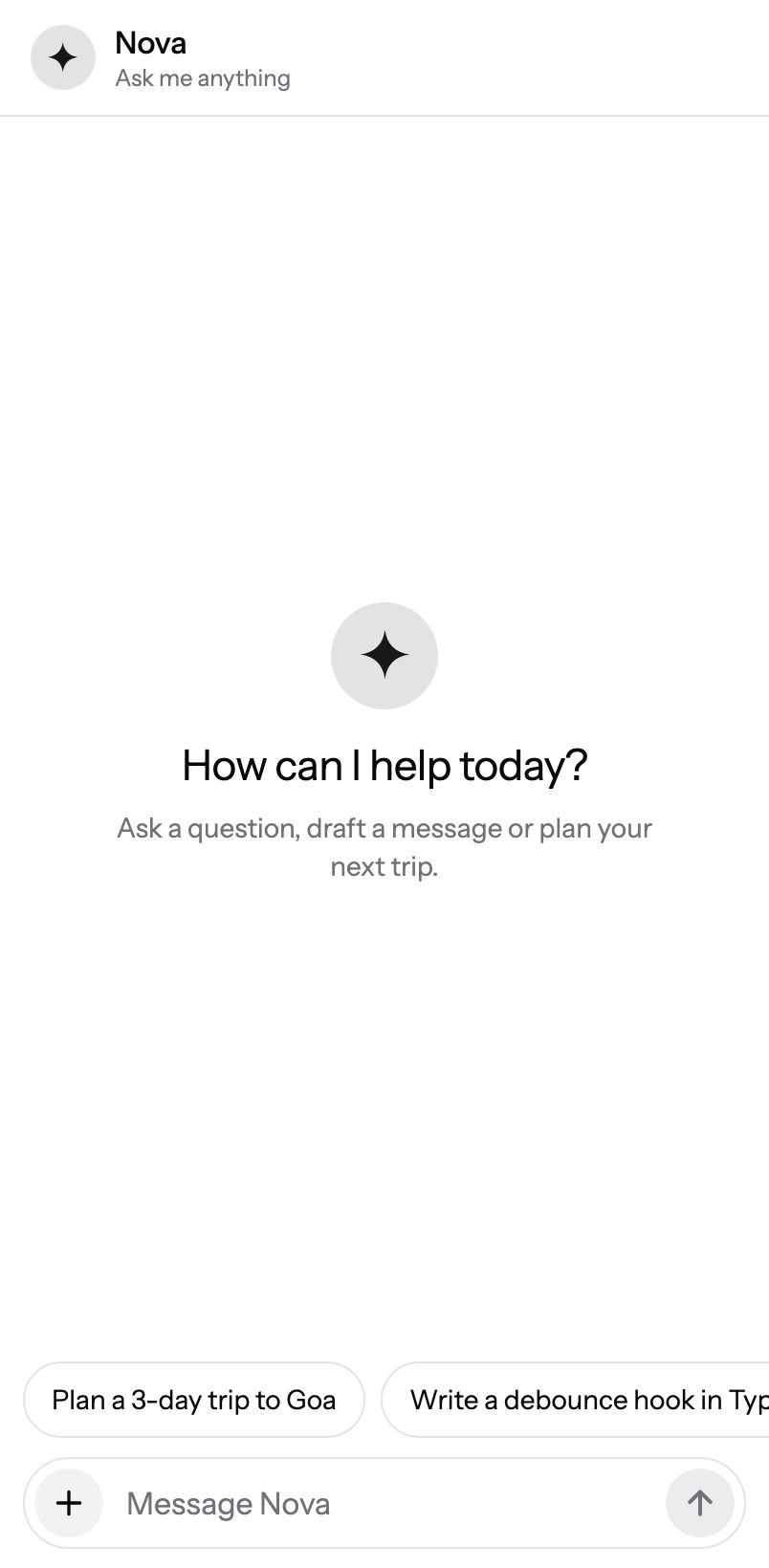
An AI assistant chat screen: replies stream in word by word with a soft fade and a blinking caret, a shimmering “Thinking…” waits for the first token, and the send button morphs into Stop. Light markdown (bold, inline code, lists, scrollable code blocks), suggestion chips, copy / regenerate / thumbs actions and a prompt field that grows to five lines and stays above the keyboard.
9:41
Checkout
Pro
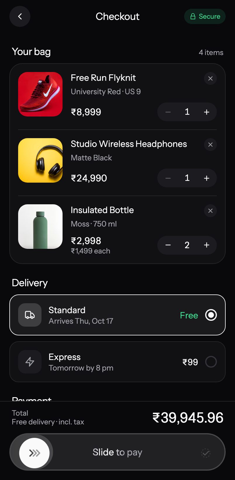
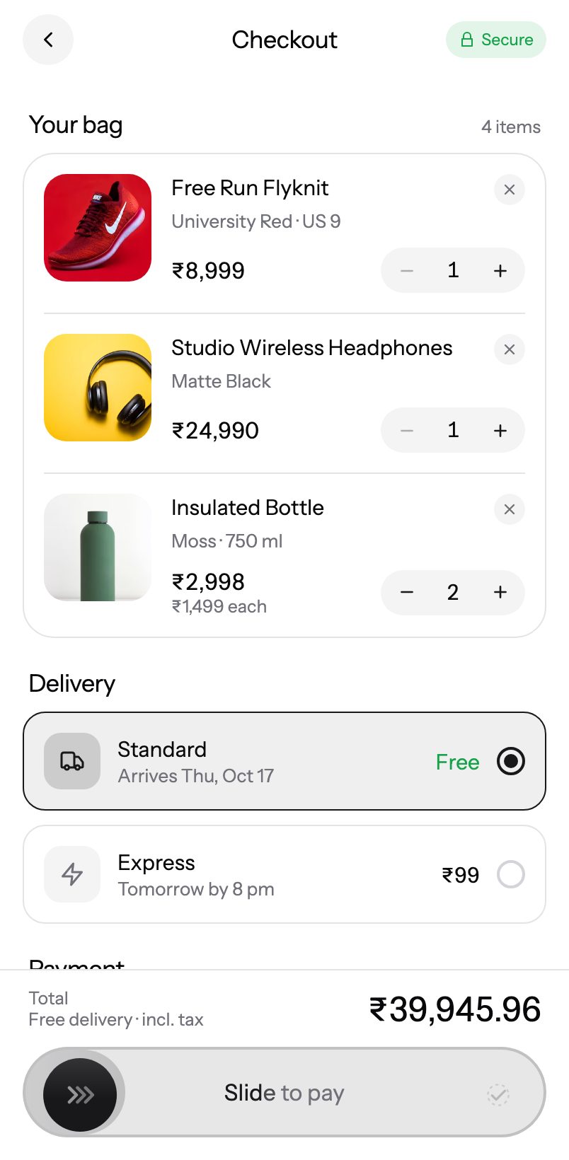
A premium checkout: product bag with quantity steppers, delivery cards, payment method, a collapsible promo code, a live summary and a sticky “Slide to pay” bar that ends on an order-placed screen.
9:41
Dashboard
Pro
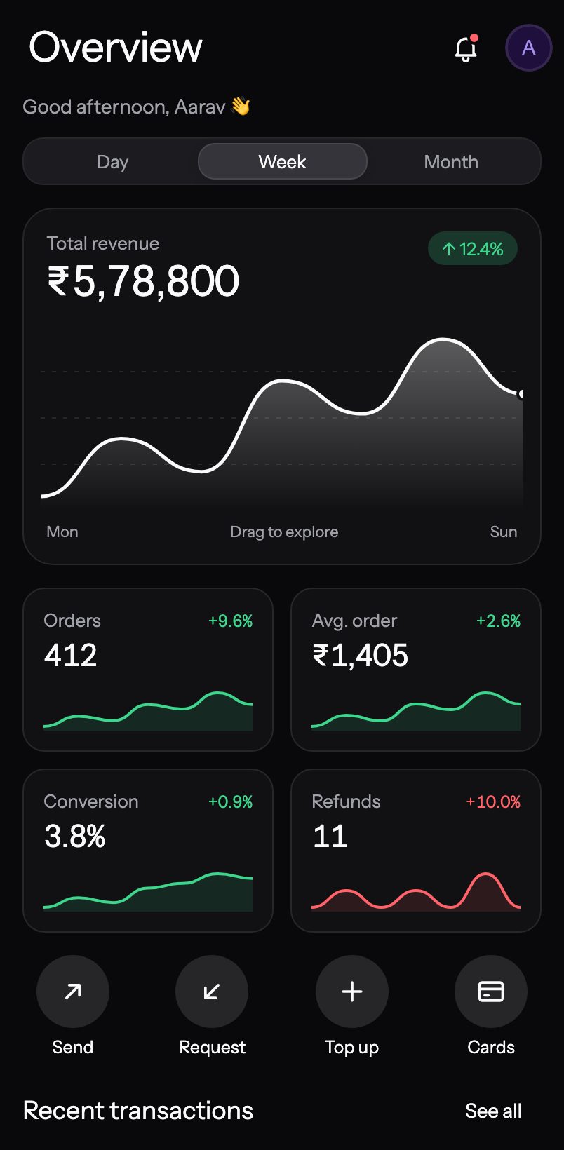
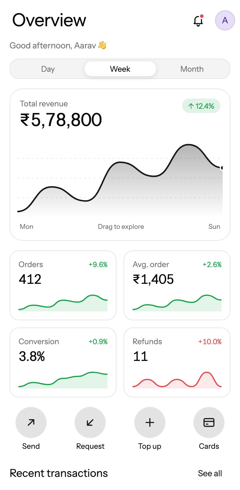
A finance / analytics home screen: a collapsing “Overview” large title with bell and avatar, time-of-day greeting, Day / Week / Month switcher, a revenue area chart that rises in on every period change and scrubs under your finger while the headline number rolls, KPI tiles with sparklines, springy quick actions and recent transactions — plus skeleton loading and pull-to-refresh.
9:41
Inbox
Pro
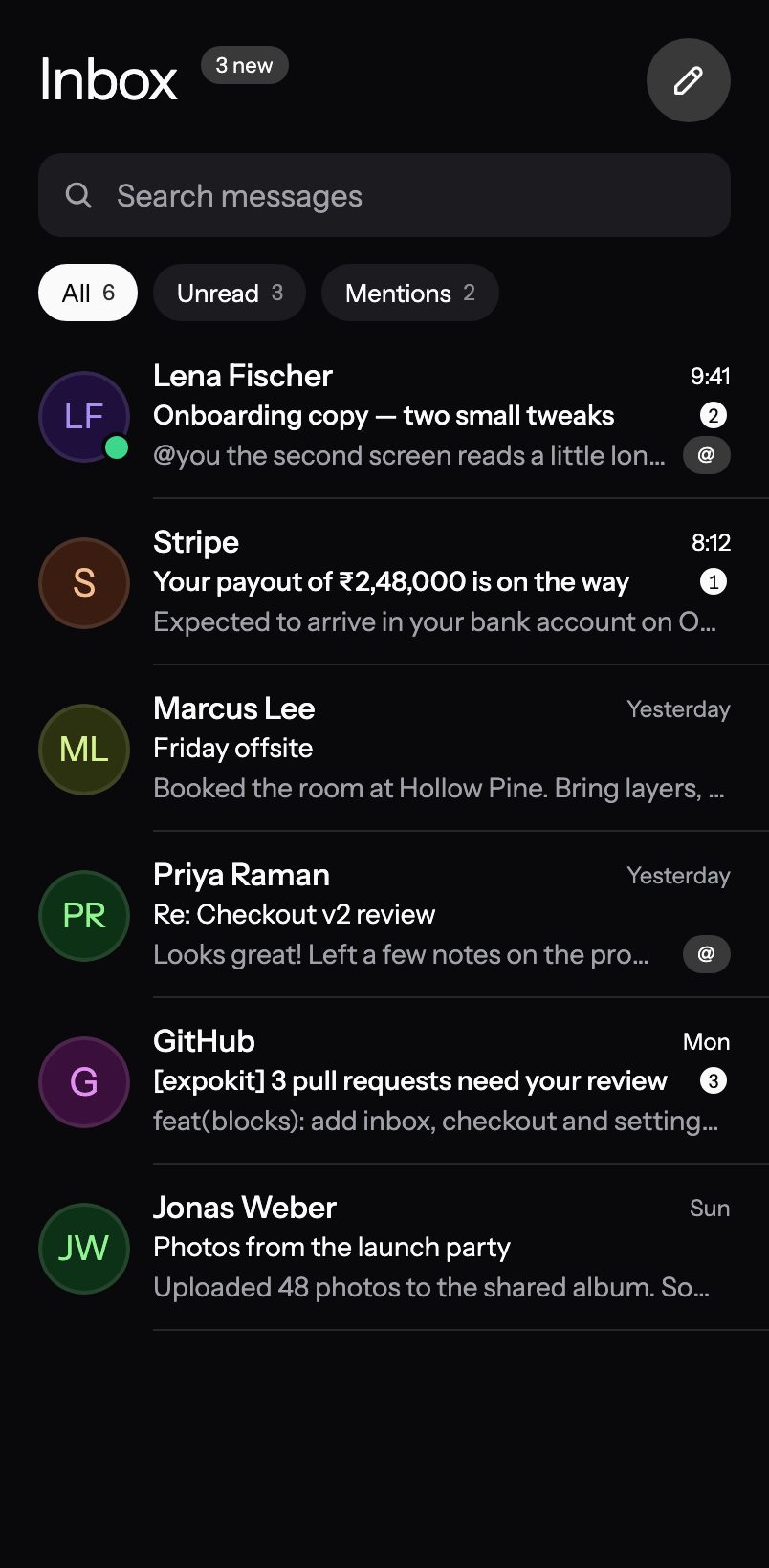
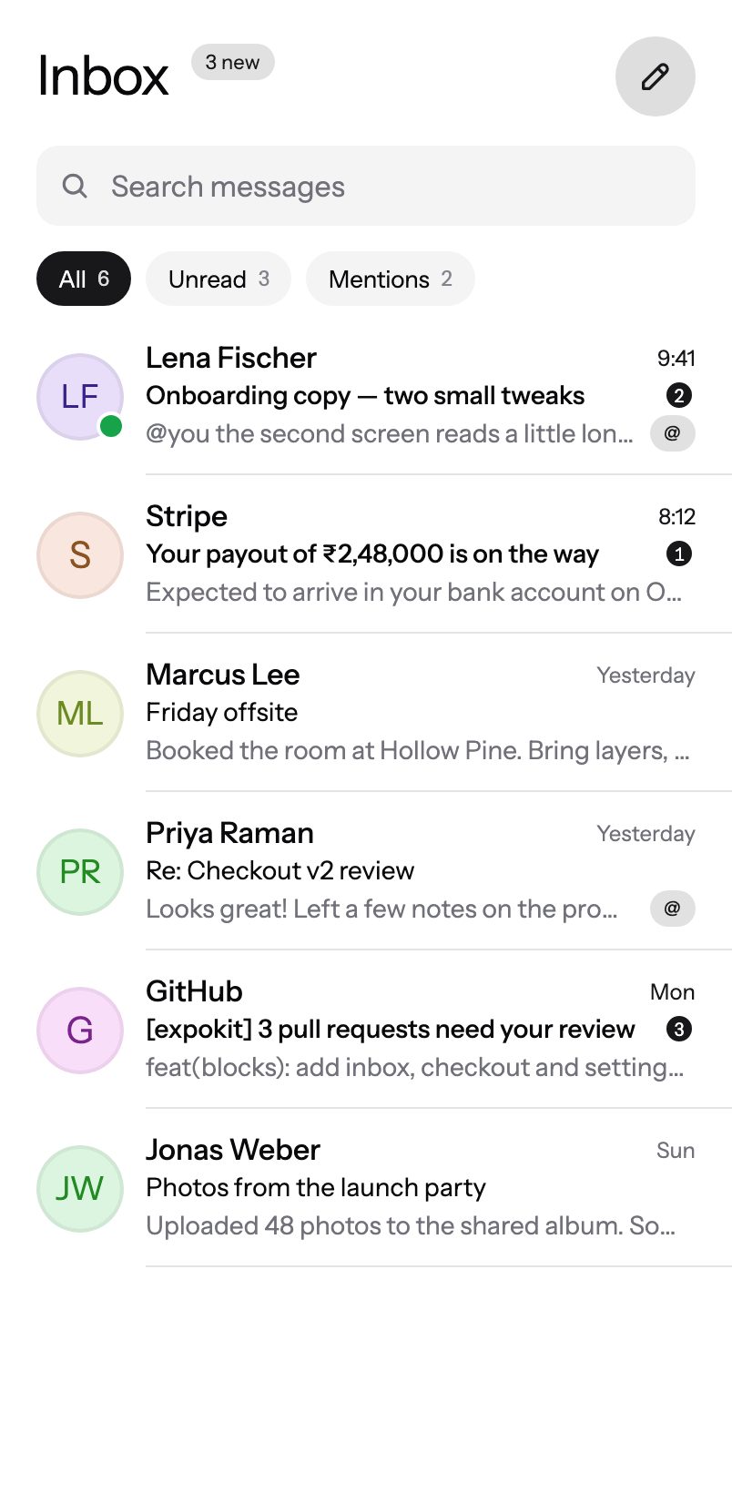
A messaging inbox: search, All / Unread / Mentions filter chips with counts, swipeable rows to archive, delete or mark read, unread count badges and a friendly empty state.
9:41
Onboarding
Pro
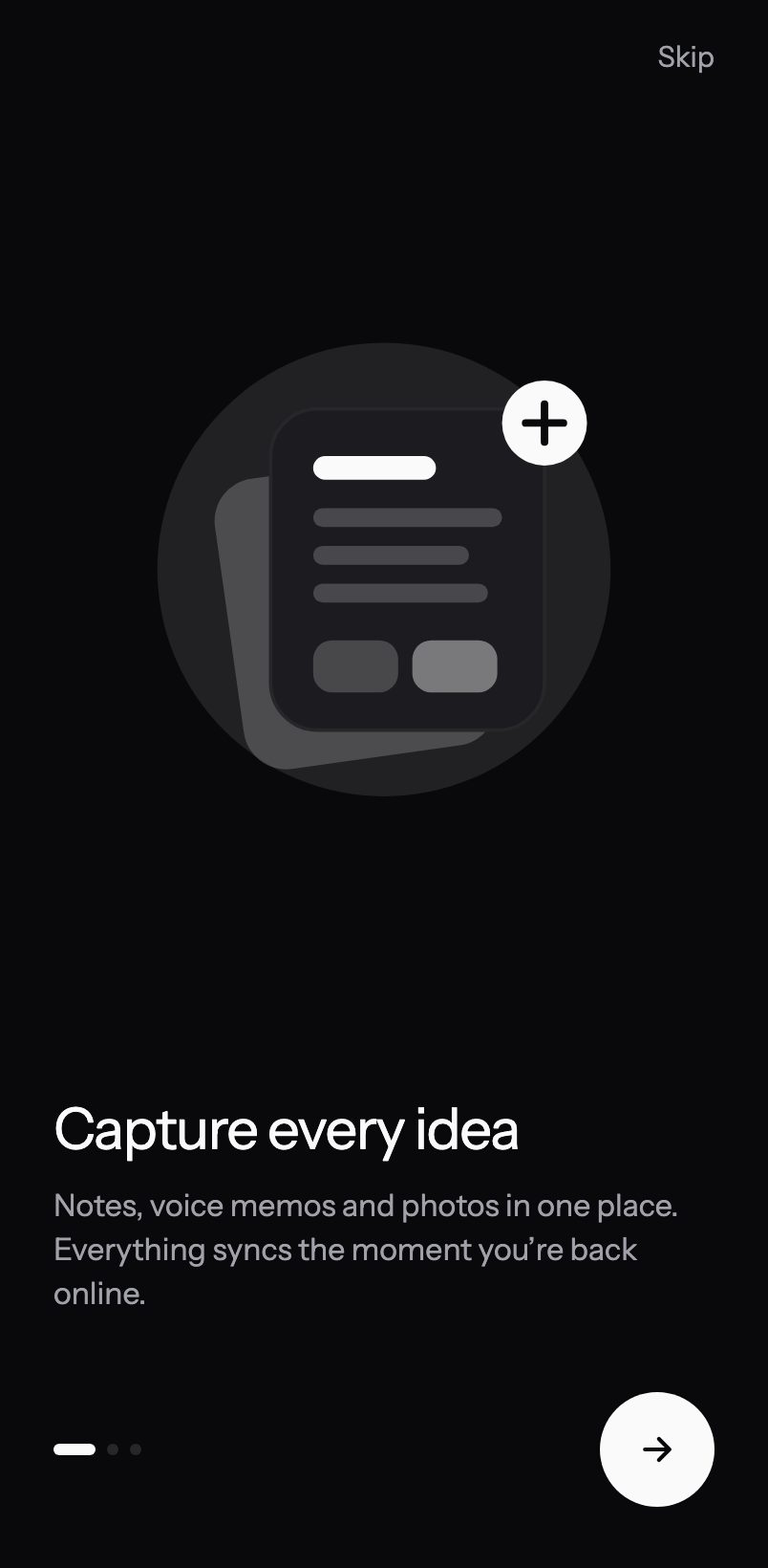
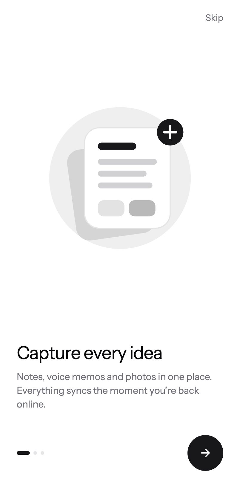
A minimal swipeable welcome flow. Illustrations float and drift with a parallax, copy slides in behind them, the active dot stretches into a pill and the round next button grows into “Get started” on the last step — all tied to the swipe. Respects Reduce Motion.
9:41
Profile
Pro
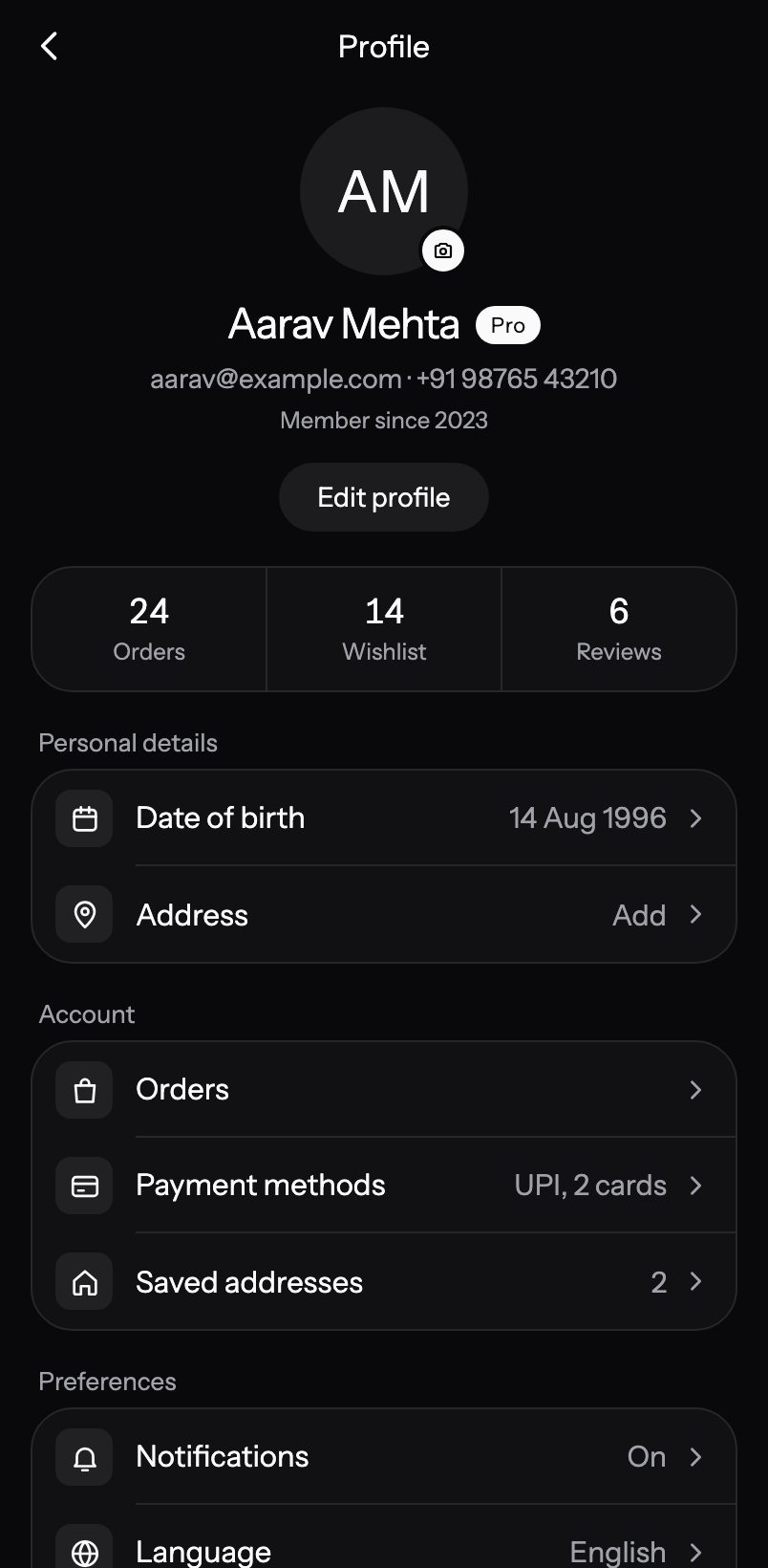
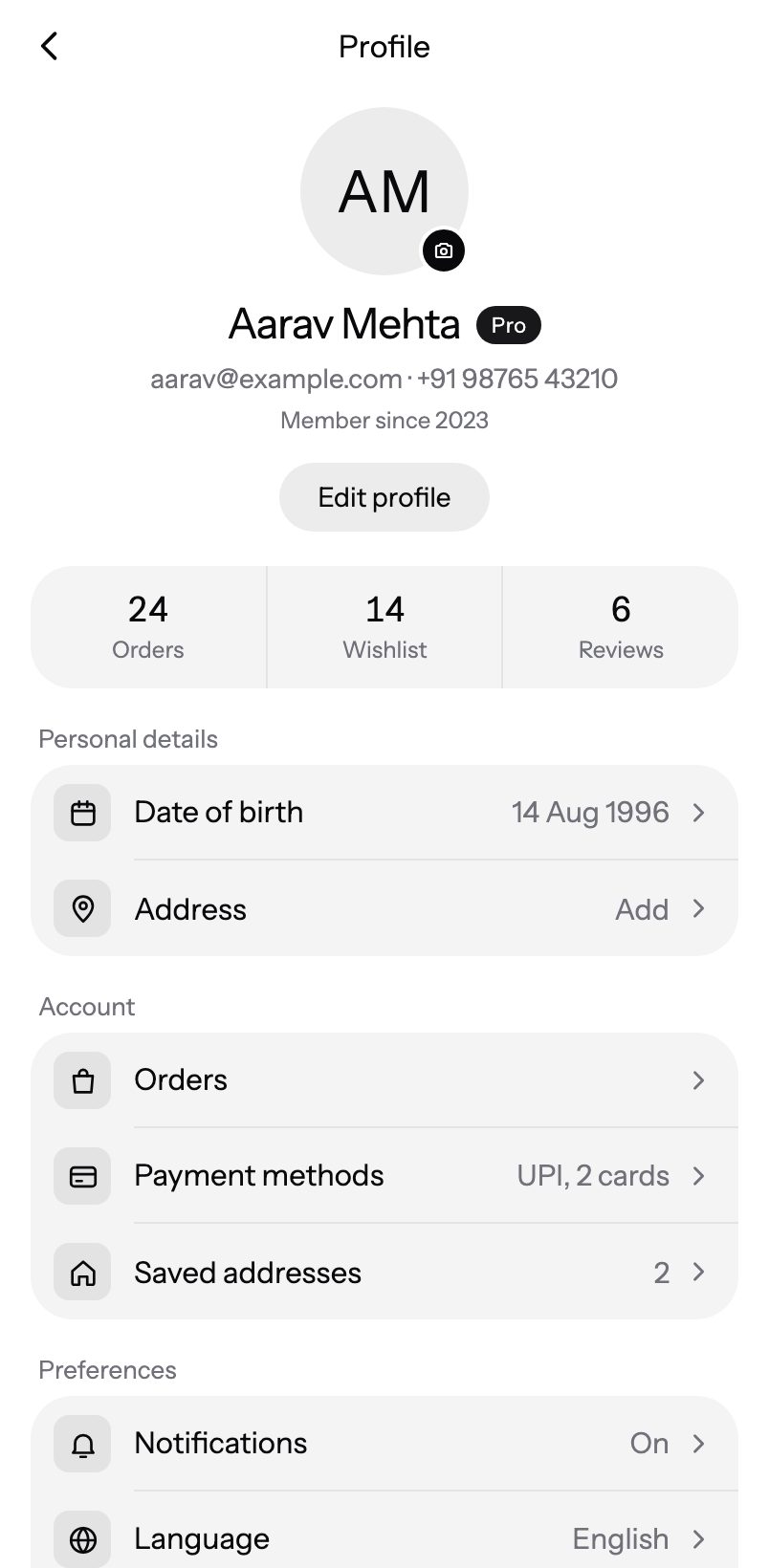
Account profile for any app: a centred header (avatar, name, badge, email · phone, Edit profile), a highlights strip, then iOS-style grouped rows for personal details, account, preferences and support, and a sign-out button. Monochrome by default; sections rise in smoothly and respect Reduce Motion.
9:41
Search Results
Pro
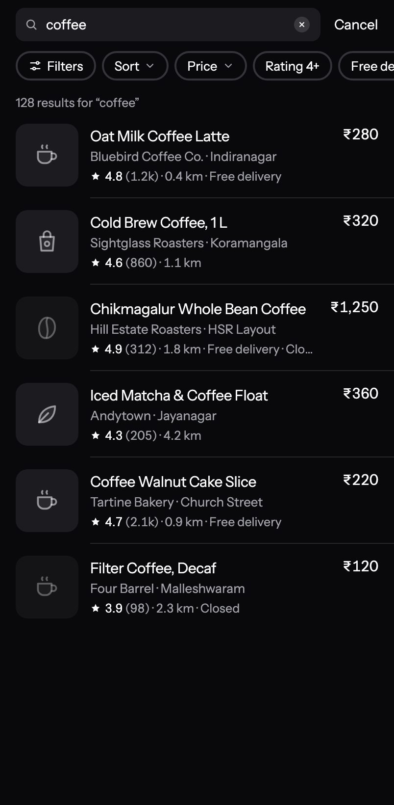
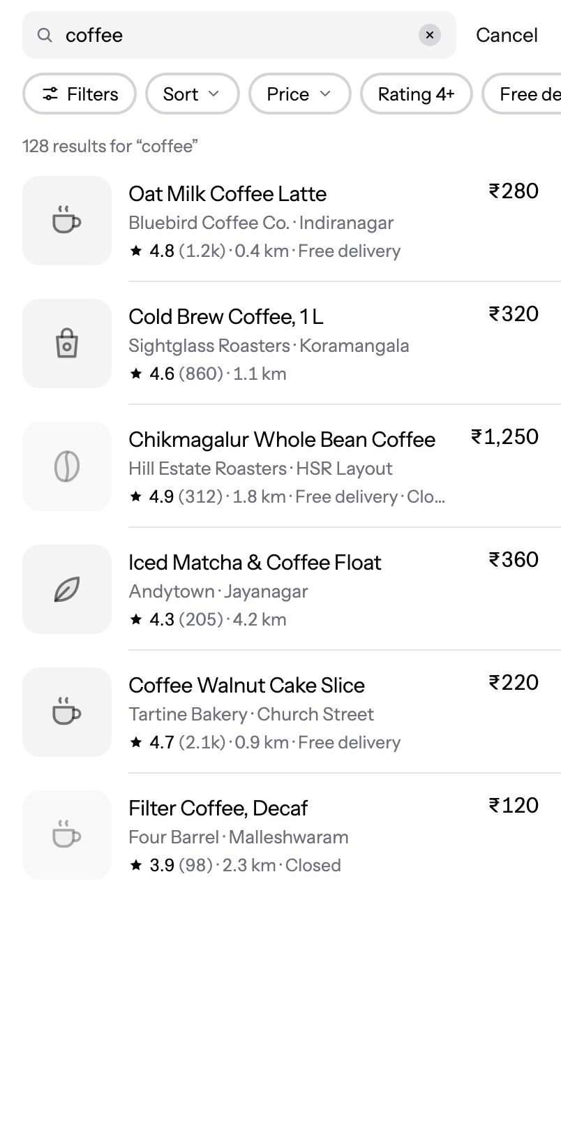
A clean, monochrome search screen: a compact pinned search field, one scrolling row of filter chips (Filters sheet, sort, price, rating, free delivery, open now), tight list rows with neutral thumbnails, rating, distance and price, Recent and Trending while the field is empty, skeleton rows while searching and a compact “No results” state — with a subtle staggered entrance that respects Reduce Motion.
9:41
Settings
Pro
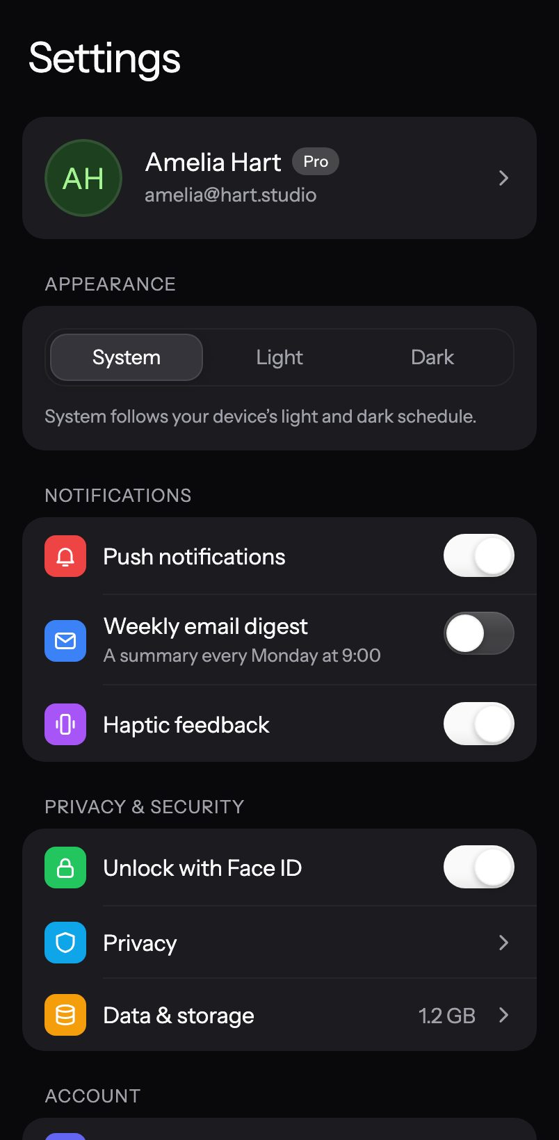
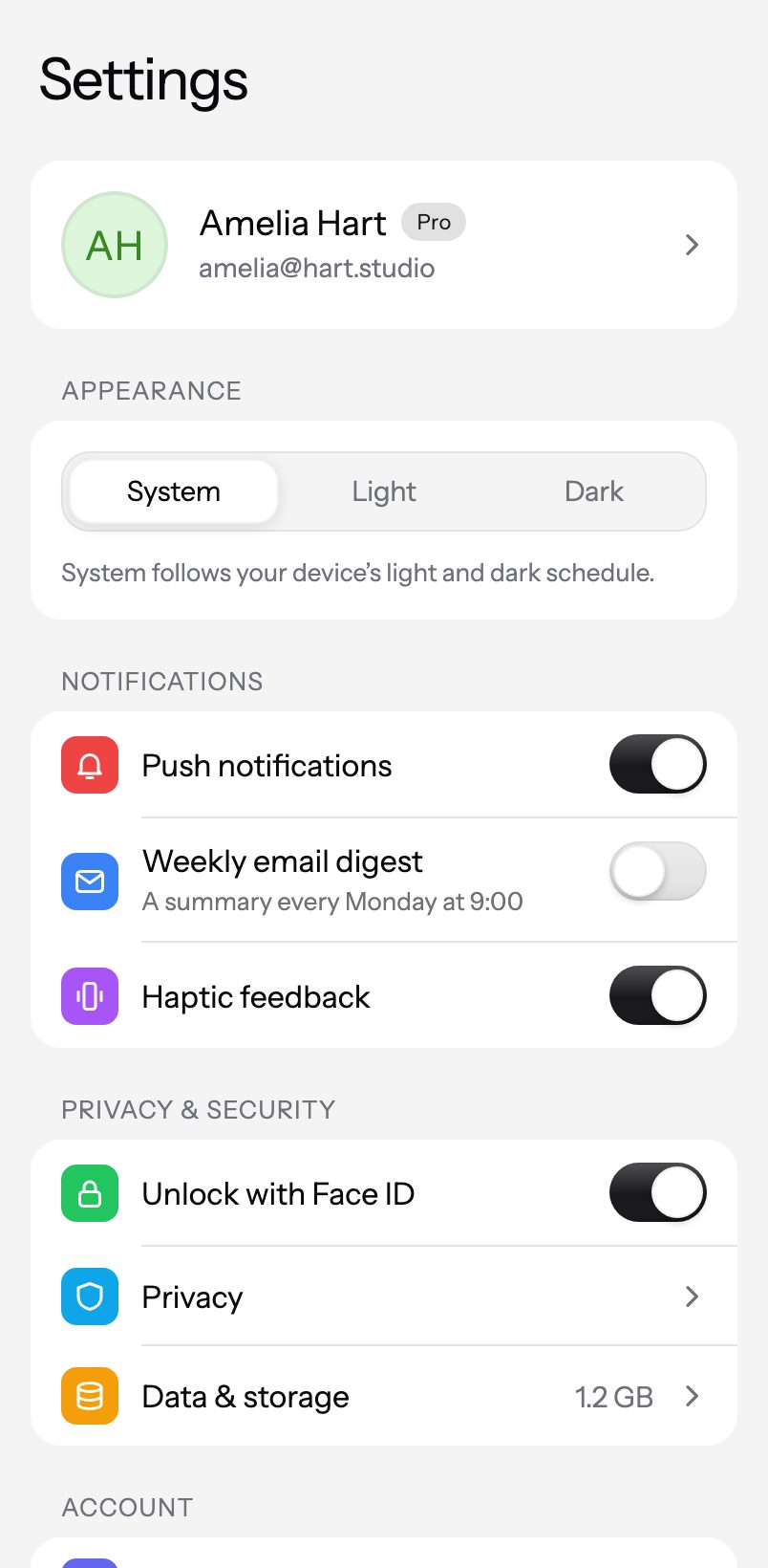
An iOS-style grouped settings screen: profile header with a Pro badge, System / Light / Dark picker, animated switches, chevron rows with details and a destructive sign-out row.
9:41
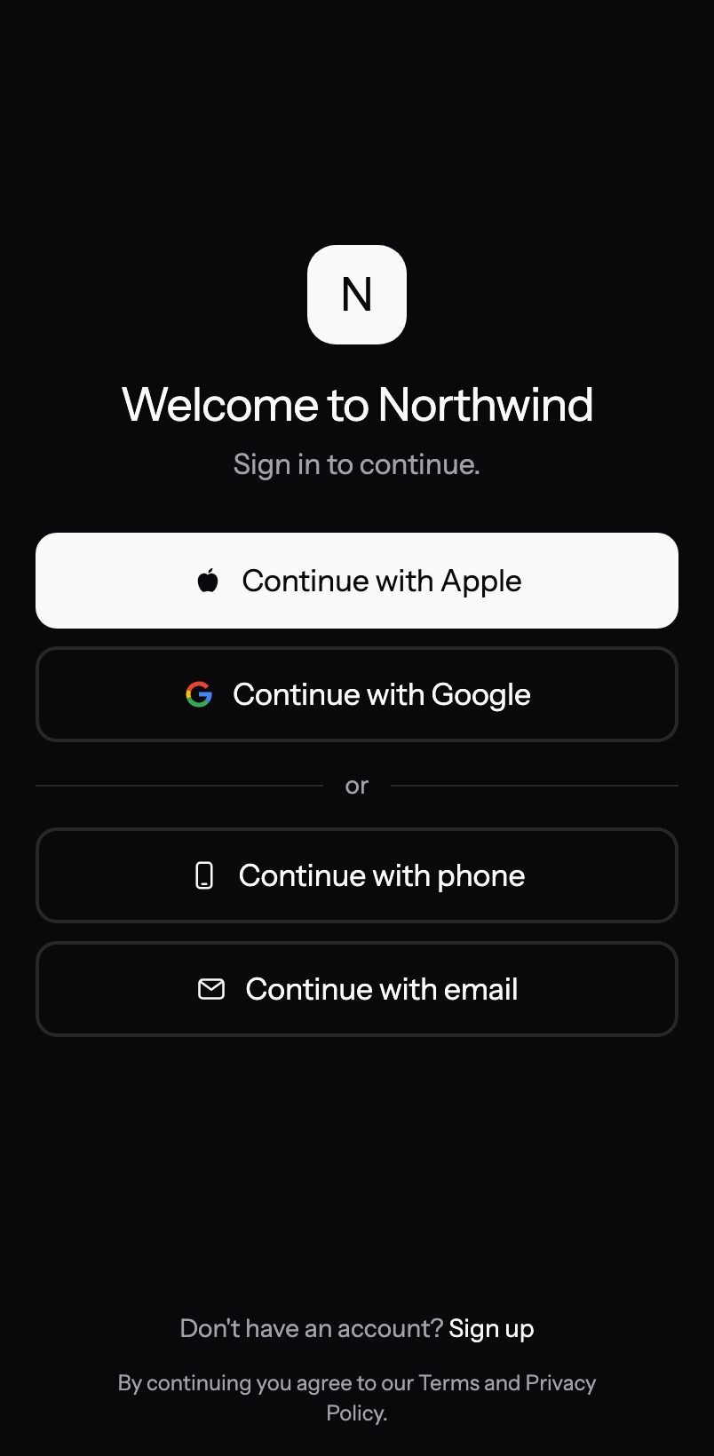
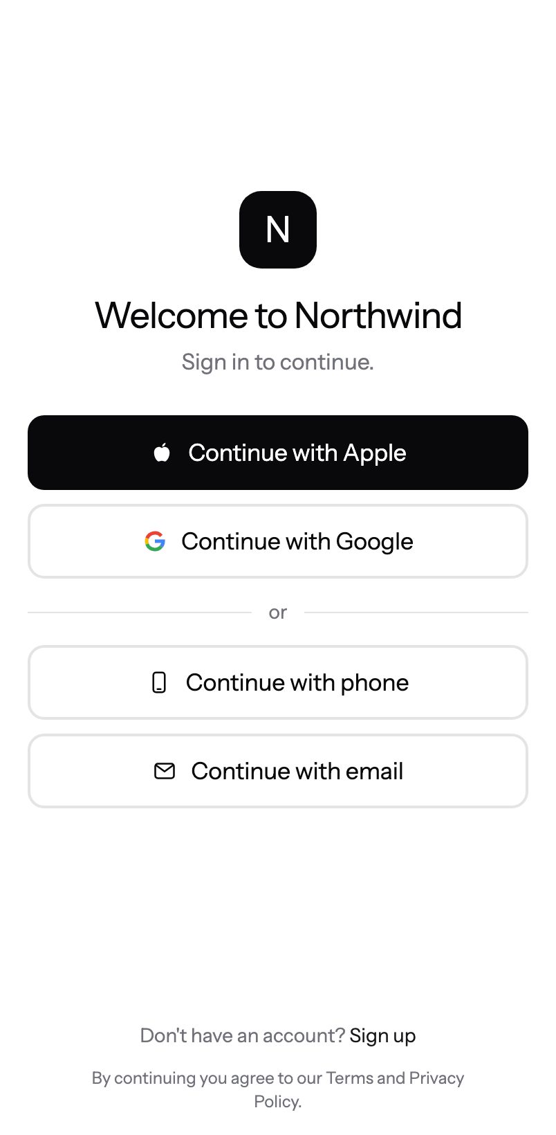
Sign In
Pro
One configurable sign-in flow modelled on top mobile apps: Apple / Google / Microsoft / GitHub buttons, phone number + SMS code with a dial-code picker and resend countdown, and email with a password (plus sign-up strength meter and forgot password), a one-time code or a magic link with a 'Check your inbox' screen. Every method is optional; steps slide in direction-aware, respect Reduce Motion, and stay clear of the keyboard. Monochrome by default.
About
Docs
Introduction
What ExpoKit is and how it works
Installation
Add ExpoKit to an Expo app
Theming
Colours, radius and dark mode
CLI
init, add, login and update
AI assistants (MCP)
Cursor, Claude, Antigravity and more
Run on your phone
Try components in Expo Go
Changelog
What shipped recently
npx @expokit/cli@latest init
Quick start
Components
Liquid Glass
8 iOS 26 glass pieces
3D
New
14 tilt, flip and stack
Inputs
12
Calendar
New
Date Picker
New
Floating Input
OTP Input
Password Input
+7 more
Selection
7
Checkbox
Chip Group
Color Swatch
Pro
Radio Group
Rating
Pro
+2 more
Buttons
7
Button
Floating Action Button
Pro
Like Button
Pro
Morph Button
Pro
Shimmer Button
Pro
+2 more
Feedback
5
Alert
Progress
Skeleton
Spinner
Toast
Overlays
4
Action Sheet
New
Bottom Sheet
Dialog
Drawer
New
Display
9
Accordion
Avatar
Badge
Card
Carousel
Pro
+4 more
Navigation
3
Bottom Nav
New
Progress Steps
New
Tabs
Motion
2
Number Ticker
Pro
Text Animation
70 components · 347 live variants
All components
Charts
Cartesian
Area Chart
Bar Chart
Line Chart
Combo Chart
Circular
Pie & Donut
Radial Chart
Radar Chart
Polar Area
Pro
3D & Pixel
Isometric Bars
Pro
Pixel Bars
Pro
Specialty
Treemap
Pro
Waterfall
Pro
Bullet
Pro
Timeline
Pro
Gauge
Candlestick
Heatmap
Funnel
Classic
Sparkline
Progress Rings
MultiLine (classic)
StackedBar (classic)
Ranking Bars (classic)
Guides
Usage & config
Patterns & effects
Show / hide anything
Chart theming
Interactions
23 charts, built on the open-source expo-charts engine
All charts
Blocks
Screens
Chat
Pro
An AI assistant chat screen
Checkout
Pro
A premium checkout
Dashboard
Pro
A finance / analytics home screen
Inbox
Pro
A messaging inbox
Onboarding
Pro
A minimal swipeable welcome flow
Profile
Pro
Account profile for any app
Search Results
Pro
A clean, monochrome search screen
Settings
Pro
An iOS-style grouped settings screen
Sign In
Pro
One configurable sign-in flow modelled on top mobile apps
9 complete screens — drop one in, wire your data
See them on devices
All blocks
Pricing
Search docs…
⌘K